This post contains affiliate links. I may earn a small commission at no cost to you.
By Renata Hellier | Global Fashion Stylist Journal
“Just stick to neutrals after fifty” is the advice that drains a wardrobe of life. Your palette is allowed to evolve. Skin, hair and eye contrast often shift in midlife, so colours that once lit your face can feel flat — or too loud. This is not a medical brief. It is a practical colour edit: test fabric near your face in daylight, favour depth over glare, and place colour where your shape wants it.
Here in Milan, the women who look most awake are not chasing a trend shade. They know their shape. They put their clearest colour where the eye should land, keep a calm partner beside it, and finish with a metal that clears the face.
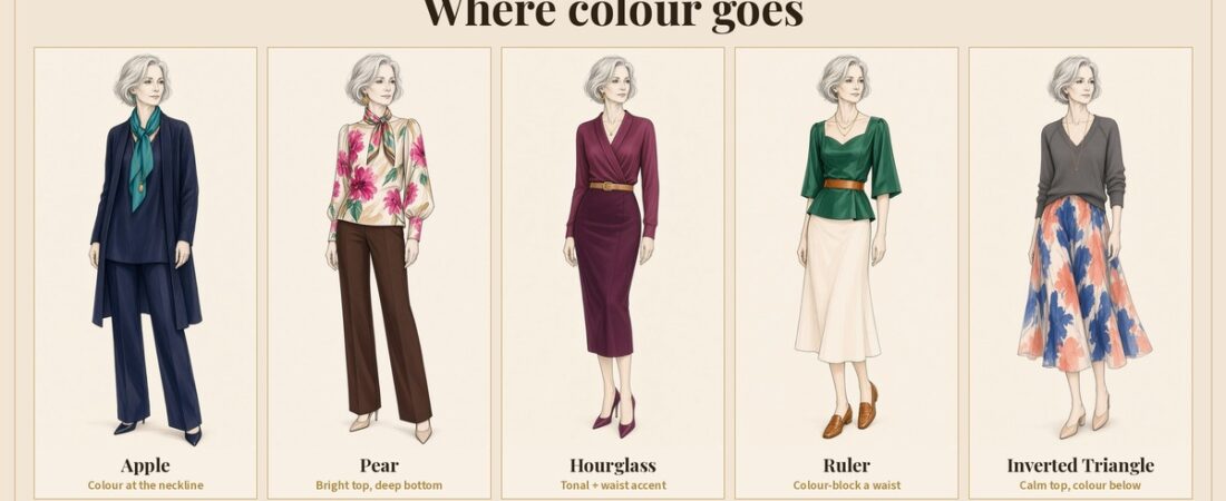
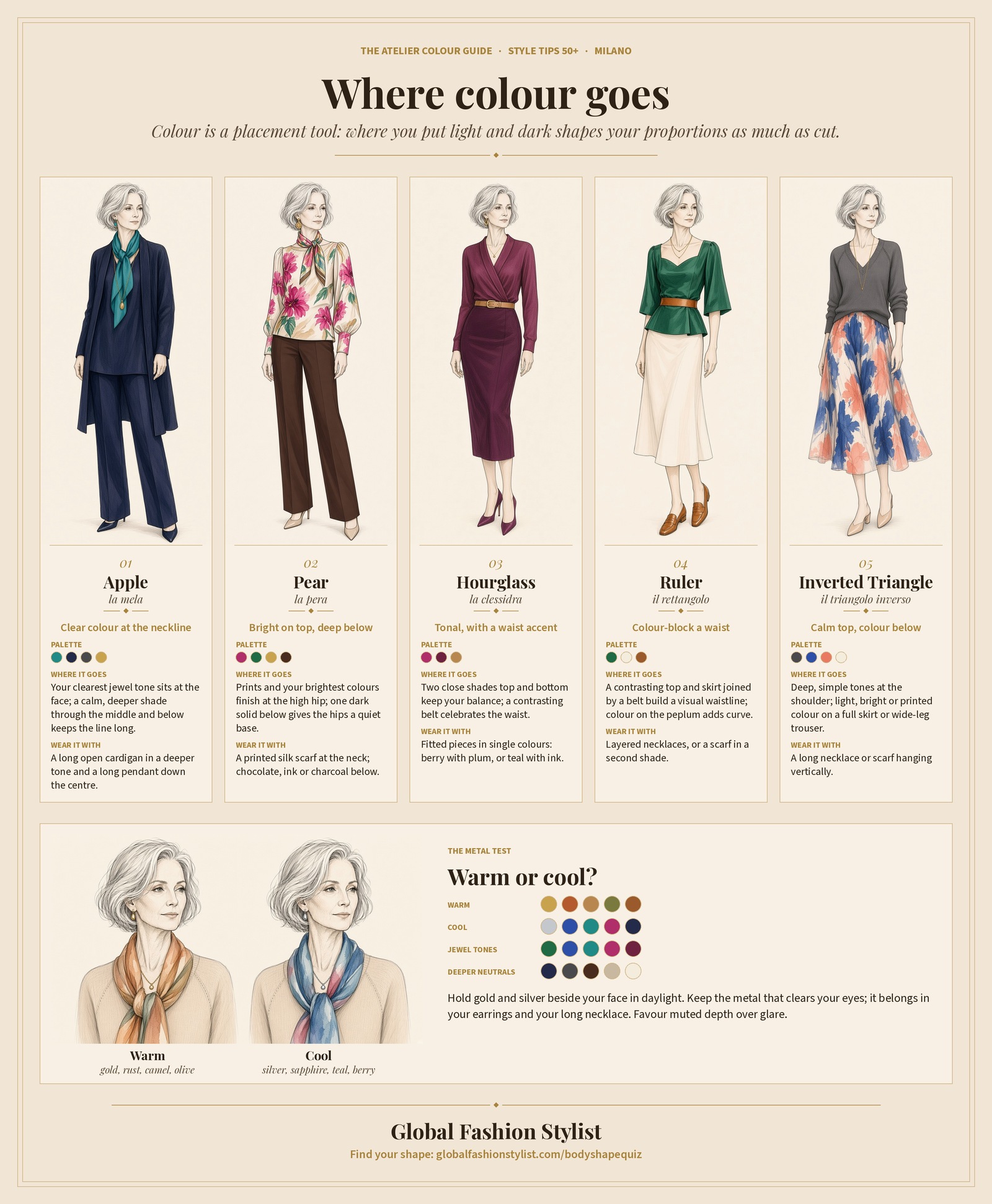
Start with the colour-zone chart below, find your shape, then read your section. Not sure which shape you are? Take the body-shape quiz first; it takes two minutes.
Your body shape and where colour goes
Colour is a placement tool. Where you put light and dark changes your proportions as much as cut does.
Apple
- Your clearest colour at the neckline. Put the colour that lights your face in a V-neck or scarf, and keep the midsection in a calm, solid shade.
- Deeper below, legs forward. Dark trousers or a dark A-line midi, with your colour repeated at the shoe or earring, keeps the line long.
- Vertical colour, not a stripe across the middle. A long open cardigan in a deeper tone, and a long necklace down the centre, keep the story moving up and down.
Pear
- Bright and printed on top. Your brightest colours and prints belong on the upper body, ending at the high hip — the La DoubleJ blouse is the hero.
- One dark, solid bottom. Dark solids below give the hips a quiet base; skip light-wash denim and pale skirts.
- A colourful printed scarf at the neck. Colour at the neckline draws the eye straight up to your face.
Hourglass
- Tonal head to toe. Two close shades top and bottom keep your top-and-bottom balance.
- Accent at the waist. Use a contrasting belt as the focal point to celebrate the waist.
- Colour that follows the line. Fitted pieces in a single colour show your curves more than busy colour blocks.
Ruler
- Colour-block to create a waist. Contrasting top and bottom, joined by a belt, build a visual waistline.
- Colour on the curve. A coloured peplum or ruffle detail adds dimension where the frame is straight.
- Layered colour at the neck. Layered necklaces or a scarf in a second shade add depth.
Inverted Triangle
- Calm, darker colour on top. Simple dark or soft tones at the shoulder keep the upper body quiet.
- Light, bright or patterned below. Your lighter colours and prints belong on wide-legs or a full skirt — the Jaeger red-mix trousers put the colour at the hip.
- Colour in a long line. A long necklace or scarf hanging vertically, not wrapped wide at the shoulder.
Not sure of your shape? Take the body-shape quiz, then come back to your section.
How we choose colour
- Test at the face, not on the hanger. Hold the garment under your chin in daylight. If your eyes look clearer and your skin looks rested, keep it. Store lighting lies; wait twenty minutes and look again — eyes adjust.
- Favour clear jewel depth over glare. The W. Cashmere cobalt sweater is a cool jewel mid — clear, not neon. Soft berry and warm stone sit kindly too; fluorescent brights rarely do.
- Use a scarf as a low-risk experiment. The Yellow The Label Axis silk scarf in green, blue and white lets you try colour near the face without a whole new knit.
- Build a three-colour day. One base (navy or charcoal), one mid (teal or soft blue), one accent at scarf or earring. More than three competing hues usually costs elegance.
- Test warm and cool metal. Hold the Isabel Marant long gold necklace beside the Jenny Bird Leon silver pendant in the same daylight. Keep the metal that clears your eyes.
- Honour the colouring you have now. Soft ecru often sits better than optical white; matte black can be striking where cheap shine hardens the face.
The colour edit
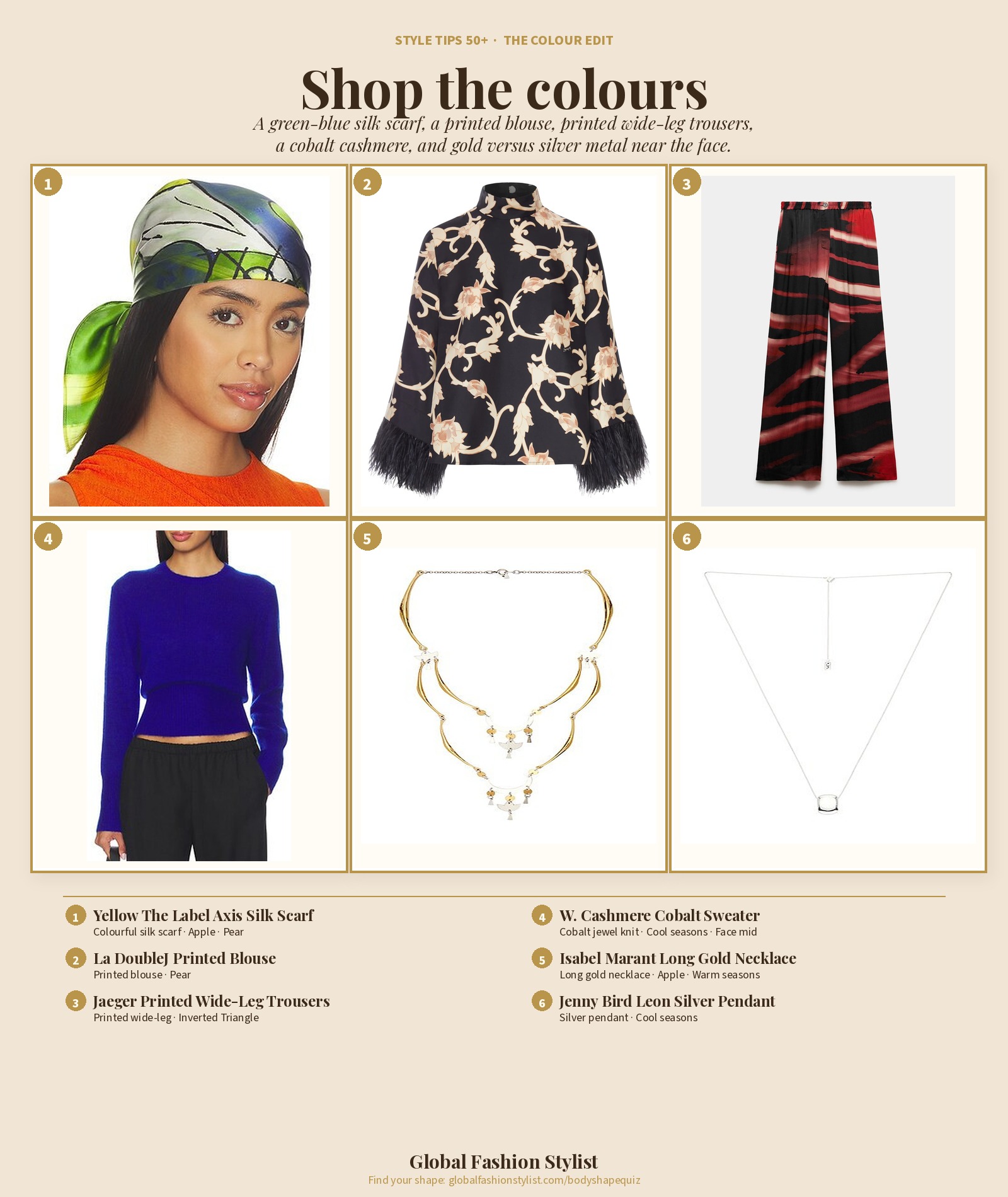
The Yellow The Label Axis silk scarf, La DoubleJ printed blouse, Jaeger red-mix wide-legs, W. Cashmere cobalt knit, Isabel Marant gold necklace and Jenny Bird silver pendant.
Shop the edit
1. Axis Silk Scarf, Green / Blue / White
Yellow The Label at Revolve · €103
Colour at the neck is the clearest face test — Apple and Pear put their brightest shade here first. Lime, forest and navy silk against the cheek.
Shop on LTK2. Printed Blouse with High Collar and Feather Cuffs
La DoubleJ · €690
Pear’s upper-body hero: a cream-and-tan print on black ending at the hip keeps the eye high.
Shop on LTK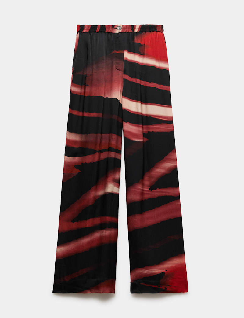
3. Printed Wide Leg Trousers, Red Mix
Jaeger at Marks & Spencer · €120
Inverted Triangle’s colour below: terracotta, cream and black print on a wide-leg that adds volume at the hip.
Shop on LTK4. Laurel Cinched Waist Sweater, Cobalt
W. Cashmere at Revolve · €422
A clear cool jewel tone — cobalt cashmere for Summer and Winter colouring. Hold it under the chin in daylight.
Shop on LTK5. Long Necklace, Metallic Gold
Isabel Marant at Revolve · €521
Warm metal near the face for Spring and Autumn; a long vertical line also serves Apple and Inverted Triangle.
Shop on LTK6. Leon Pendant Necklace, Metallic Silver
Jenny Bird at Revolve · €152
Cool metal for Summer and Winter — hold gold and silver beside your face in daylight and keep the one that clears your eyes.
Shop on LTKPrices shown at the time of writing; check LTK for today’s price and availability.
Read next
- How does colour analysis work for women over 50?
- How can I shop smarter for my body shape and colours after 50?
Your colours are not something to apologise for. Place them where your shape wants attention, test cobalt and scarf colour in daylight, and finish with the metal that clears your face. Honour the colouring you have now — and let people see you.
Download Global Fashion Stylist
Your body shape, your colours, your wardrobe — styled for 50+.